announcing …
th!nkpricing brings you knowledge and products that help you along your pricing journey. Today we want to share with you a sneak peak of our first SaaS product, the evaluator. It uses our sophisticated pricing model to help you build a pricing strategy tailored to your needs. Over the next few weeks, we will introduce you to various features of the evaluator. Today, we start with our unique Heatmap Graph which provides information on how your product pricing performs.

how are your prices performing?
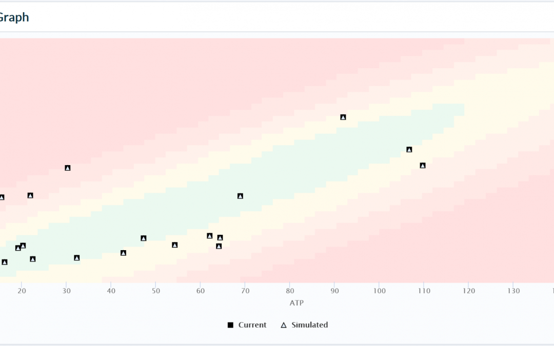
The Heatmap gives you the ability to see where price meets demand. Have you ever wondered how your prices and your demand interact? With the Heatmap, you can see the distribution of prices against actual products sold and where you missed out on either sales, revenue or even both. We use your sales transactions to give you insights into your customer buying patterns. By applying incremental price changes to your product, you can watch the quality of your distribution improve.
how does the Heatmap work?
The graph gives you an overview of your product distribution based on average price and products sold. The distribution is built on your imported data and is created by comparing the performance of your prices to each other. In short, the graph displays the well priced products against the poorly priced products. In the screenshot above you can easily see the differences by the color coding: those prices in or near the green area are well priced; those outside of the green area can be improved. Hovering over a point will show you how the number of products sold compares to the average product price.
In our model, Products are not related by date/time of sale but by sales performance. Instead of randomly searching for areas of poor performance, you can easily see where there is a disconnect between your average price and products sold. Now you may want to know what we mean by “product”. We define a product as access to “what” is being sold; eg. an event, a concert, a skiday. Each individual ticket is a sub-product classified by the type and quality of access being provided, eg. standing room vs orchestra, or adult vs child, or even pre-event access.. This gives you the ability to see the performance of all of the prices related to a specific product. In the next step, you can drill down to see individual areas that need improvement. Once you find those areas, the system lets you make changes and apply them to the Heatmap, a process we will explain in detail in our next article!

stay tuned …
Look for the upcoming announcement of our website for more information on the various features of the evaluator or sign up for our newsletter to be notified of new updates and release information. Next week, we will look at how you can start creating a pricing strategy. Follow us on our social channels to be the first to take a look!